5 Best Bold Retro Fonts for Your Squarespace Website
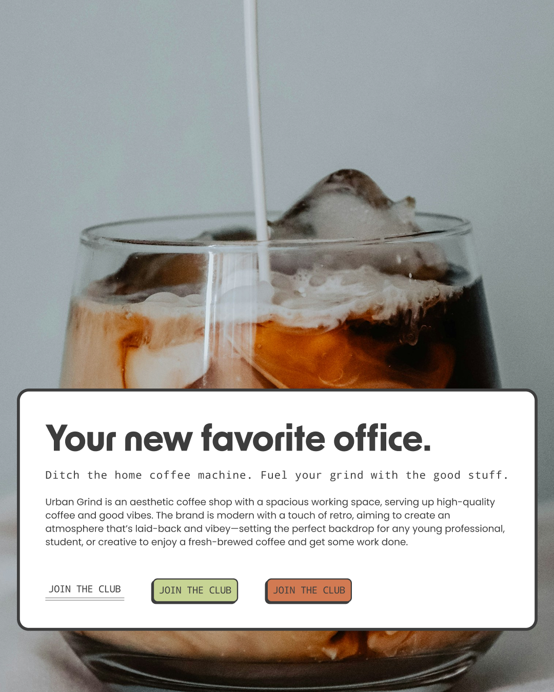
The typography sample from my Urban Grind project.
I compiled this list while looking for the perfect fonts for a retro Squarespace website template I’m currently designing. And if you’re here, I’m sure you’re familiar with the struggle of scrolling through Squarespace’s seemingly never-ending font library trying to find that one font you already have pictured in your head.
So, I did some of the digging for you.
Here are five of my favorite groovy, retro fonts to use in your next Squarespace website design. Think 70s, Bauhaus, disco, big type, weird shapes, and just generally a lot more personality.
The best part? They’re all available right inside Squarespace, so you don’t need to buy or upload a custom font to get the look.
And if somewhere between choosing fonts, colors, layouts, and approximately 400 other tiny website decisions you decide you’d rather have someone else do it, get in touch with Chartreuse Studio. I’d love to help.
1. All Round Gothic
The vibe: 70s, groovy, rounded, playful
Starting with my favorite because obviously.
All Round Gothic is actually the font that inspired this entire list. I kept coming back to it while designing my newest retro Squarespace template, and I’m kind of obsessed.
It has those chunky, rounded letterforms that immediately give you a little 70s without feeling like a novelty font. It’s fun, a little funky, and has a ton of personality, but it’s still clean enough to use on an actual business website.
I especially love it BIG. Give me All Round Gothic with warm browns, butter yellow, red, stripes, oversized type, and some good flash photography.
Even better, pair it with something super clean and modern. I’m currently using All Round Gothic with Noto Sans on the new template, and the contrast between the two is so good.
Where I’d use it: Big headlines, buttons, calls to action, navigation, and short statements that you actually want people to notice.
2. Stolzl
The vibe: Bauhaus, geometric, artsy, cool
If All Round Gothic is my 70s pick, Stolzl is my Bauhaus pick.
It’s geometric and clean but still has enough personality to make a really simple layout feel interesting. I especially love it when it’s oversized with lots of space around it and a really bold color palette.
This one can go in so many directions too. I could see it working for a creative studio, architect, interior designer, restaurant, wine bar, photographer, fashion brand, or pretty much any business that wants something a little more design-forward.
Where I’d use it: Oversized headings, navigation, buttons, and short statement text.
3. Dunbar Bold
The vibe: chunky, graphic, 70s editorial
Dunbar Bold is another really good option if you want something bold and geometric but still clean.
It has enough personality to make a simple Squarespace layout feel more designed without needing to add a million other things around it.
And this is another one I want BIG.
If you’re going to use a bold display font, let it be bold. Make the headline huge. Let it take up some space. Pair it with something much quieter for your body copy and let Dunbar do its thing.
Where I’d use it: Hero sections, big headlines, editorial layouts, and statement text.
4. Futura Bold
The vibe: classic, geometric, mid-century meets 70s
You really can’t make a list of retro fonts without Futura.
It’s a classic, but that’s also what makes it so good. Depending on what you put around it, Futura can feel Bauhaus, mid-century, 70s, editorial, or completely modern.
I especially like the bold weights for websites because they give you a really strong graphic headline without being overly decorative.
Try it huge. Try it lowercase. Pair it with a weird color. Put it next to vintage photography. There are a million ways to make it feel completely different.
Where I’d use it: Headlines, navigation, buttons, subheadings, and big graphic type.
5. Afacad Bold
The vibe: modern retro, clean, graphic, creative studio
Afacad is probably the least obviously retro font on this list, but that’s exactly why I like it.
Not every element of a retro website needs to scream 1974.
Afacad Bold has a clean, geometric feel that works really well alongside more obvious 70s or Bauhaus elements. Let the colors, layout, photography, illustrations, and weird little details bring in the retro personality and use Afacad to keep everything grounded.
It’s also really usable, which matters when you’re designing an actual business website and people need to, you know, read it.
Where I’d use it: Headings, subheadings, navigation, buttons, and supporting copy.
My Favorite Way to Pair Retro Fonts
One of my favorite ways to use a retro font is actually to pair it with something that feels completely modern.
If the display font already has a ton of personality, I don’t necessarily want the second font competing with it.
Give the retro font the giant headline and pair it with something clean and monospaced like Noto Sans Mono for your body copy, navigation, small labels, and all the other little bits of text throughout your website.
You can also bring in a clean modern monospace for little labels, buttons, numbers, or editorial details. I love the contrast of something slightly technical and structured next to a big, groovy display font.
Right now, my favorite combination is All Round Gothic + Noto Sans Mono. All Round Gothic gets to be the fun one while Noto Sans keeps everything else clean and current.
It gives you the retro feeling without making the entire website feel like a theme.
How to Make a Retro Website Feel Modern
My biggest advice is to resist the urge to make everything retro.
You don’t need a funky font + orange and brown + wavy lines + daisies + disco balls + grain + stripes + starbursts + 17 vintage illustrations all fighting for attention.
Pick a direction and choose a few elements that really sell it.
If you’re leaning Bauhaus, try geometric typography, bold blocks of color, simple shapes, and more structured layouts.
If you want something more 70s, I love rounded typography, warm colors, stripes, oversized type, and slightly imperfect photography.
And if you want a little disco, play with dramatic scale, flash photography, unexpected colors, and typography that takes up an almost unreasonable amount of space.
The goal isn’t to make your website look like it was actually built in 1974. It’s taking the good parts and making them work for a brand now.
The Retro Squarespace Template That Started This Whole Thing
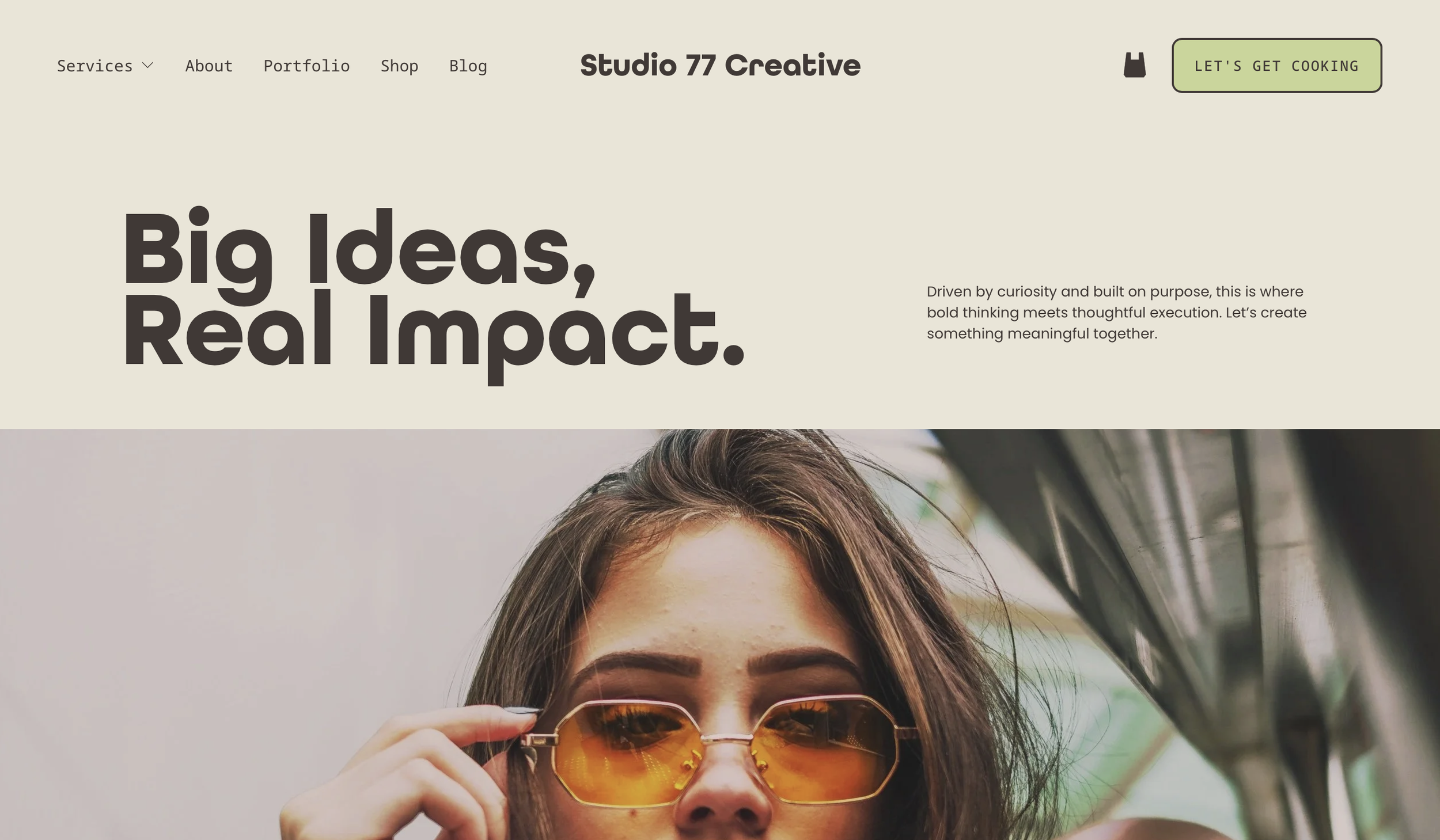
The Studio 77 template in the works.
Remember the retro Squarespace website template I mentioned at the beginning?
I’m currently designing it for creative agencies, coaches, virtual assistants, and other creative service businesses that want a website with a little more personality.
And yes, I ended up using All Round Gothic + Noto Sans Mono.
It’s bold, colorful, retro-inspired, and definitely not beige. It’ll be available to purchase from Chartreuse Studio once it’s finished.
Once it launches, I’ll add it here so you can see these fonts actually working together in a full website design.
And Yes, These Fonts Are Available in Squarespace
Another reason these five made the list is that you can find them right inside Squarespace’s font library.
That means no hunting down font files, purchasing an additional font license, or figuring out how to upload a custom font just to get the look.
Head into your Squarespace site styles, open your font settings, and start playing around.
If you don’t have a Squarespace website yet, you can start your Squarespace website here.*
Rather Have Someone Else Design It?
Picking out fonts and colors is fun. Figuring out how the fonts, colors, photos, layouts, buttons, spacing, mobile design, and approximately 400 other tiny details work together can start to feel like... a lot.
If you want a head start, I create Squarespace website templates for small businesses that are colorful, customizable, and made for businesses that want their website to have an actual personality.
Shop Squarespace Website Templates →
And if DIY isn’t really your thing, I also offer custom Squarespace website design for small businesses that want something completely their own.
*This post contains an affiliate link. If you sign up for Squarespace through my link, I may earn a commission at no additional cost to you.